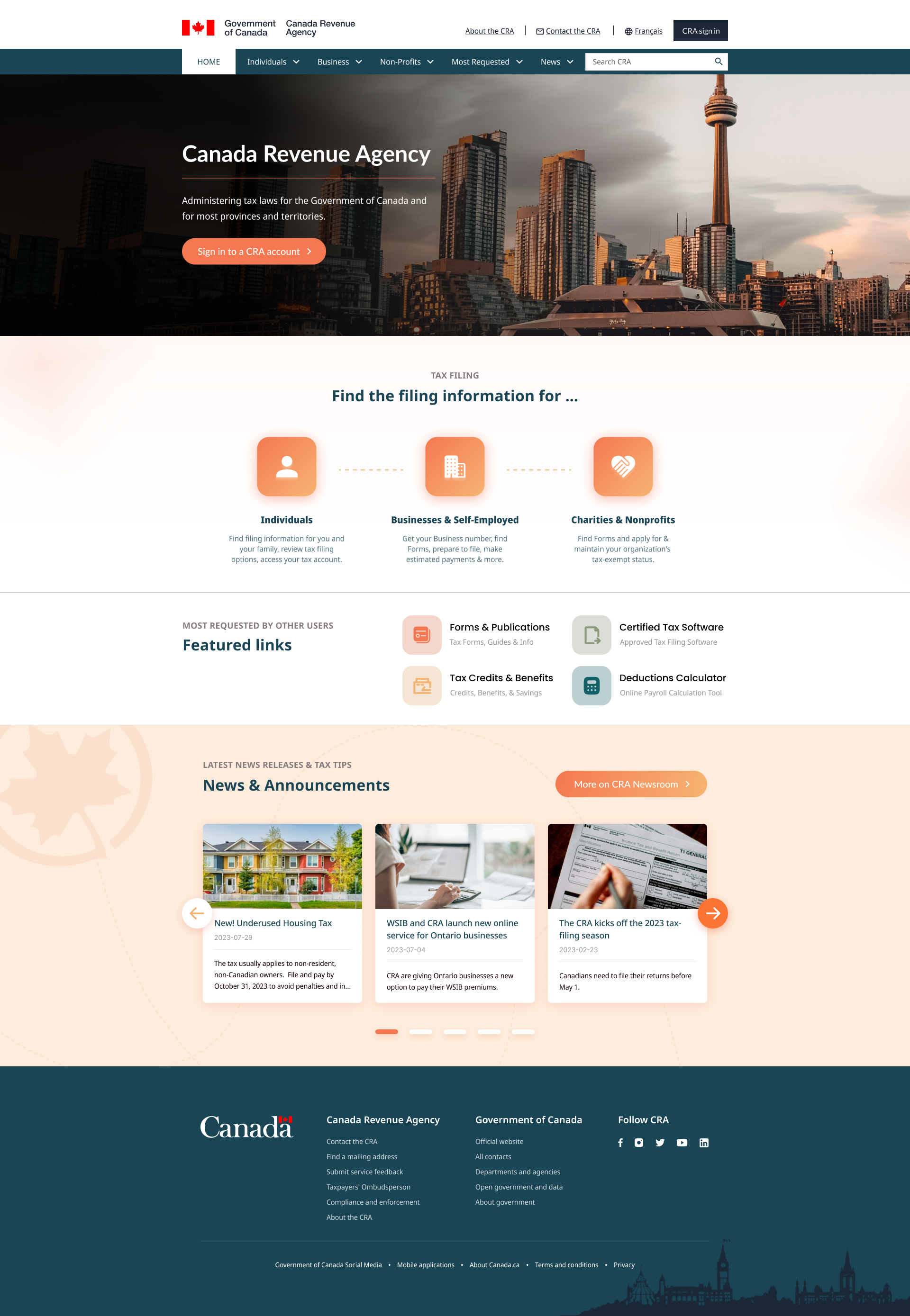
Canada Revenue Agency Website Redesign
The CRA website was historically marked by navigation difficulties and outdated aesthetics, causing users to experience frustration and potentially leading to non-compliance issues. Recognizing these challenges, I embarked on a comprehensive redesign. The new design prioritizes intuitive categorization, clear labels, and streamlined user paths, aiming to significantly enhance the overall user experience and ensure clear resource accessibility.

This is a project for UofT SCS UX/UI Design bootcamp.
Team
Individual
Duration
5 Weeks
Role
UX Researcher,
Web Designer
Time
Aug 14 2023 ~ Sept 18 2023
Background

The Canada Revenue Agency (CRA) is a federal agency responsible for administering tax laws, delivering social and economic benefit programs, and ensuring compliance on behalf of governments across Canada. Since its establishment, the CRA has been a pivotal institution in managing the financial backbone of the country, providing essential services to both individuals and businesses.
The Problem

While CRA's role is crucial, its website has historically faced challenges that could hinder its efficacy. The primary issues identified were:
  • Difficulties in navigation that led to user frustration, potentially causing non-compliance due to a lack of clarity.
  • A need for a user interface redesign with intuitive categorization, clear labels, and improved user-path optimization.
  • Refining the aesthetic appeal of the site to make it more user-friendly, approachable, and modernized.
Click to see wayback machine capture of the website on Aug 17 2023

Not interested in my design process?
That's perfectly okay!

Teleport to the Final Product
Research

User Research

To lay a solid foundation for usability testing, I initiated the research process by crafting a proto persona and an user path analysis. This initial phase was essential to pinpoint the precise objectives of the subsequent Guerrilla usability testing.
Moodboard

A moodboard is a curated collection of visuals, colors, and design elements that encapsulate a project's desired aesthetic. For the CRA website redesign, this moodboard was essential to establish a cohesive visual direction and to align design choices with the intended user experience and branding.
Link to Detailed InVision Moodboard
Information Architecture

Moving into the Information Architecture stage, with an emphasis on optimising the website's navigation, an in-depth website navigation analysis was undertaken. Observing inefficiencies in the current navigation structure, a card sorting exercise was initiated. This process entailed reorganising every page on the CRA website into new primary and secondary navigational categories. Card sorting is invaluable as it guarantees intuitive and logical navigation. Based on the insights gleaned from the card sorting, a comprehensive sitemap was subsequently developed.
Based on the refined sitemap, a prototype for the navigation and footer was then crafted.
Usability Testing

Upon crafting the first draft of the high-fidelity prototype for both desktop and mobile interfaces, a Five-Second Usability Test was initiated. This method is a pivotal usability evaluation technique that revolves around first impressions. Given today's rapid-paced digital consumption patterns, capturing a user's attention immediately is crucial.

Here's how the test was conducted:
Participants were presented with the CRA prototype's homepage for a strict duration of five seconds. Following this brief exposure, they were posed a series of questions targeting their recall and impressions. Questions spanned from recognizing the brand to identifying visual elements that caught their attention.
Test Results at a Glance:
  • Brand Recognition: The CRA brand was promptly recognized by the majority of participants.
  • Visual Elements: Key takeaways included the prominence of the sign-in button and the clear differentiation between individual, business, and charity tax filing options.
  • Emotional Response: Overall, the design was perceived as transparent and notably user-friendly, especially when juxtaposed with standard government websites.
  • Call-to-Action: The intent to sign in was clear, yet some participants believed its visibility could benefit from slight enhancements.
In response to the quick insights from the Five-Second Test, several decisive changes were made to the CRA prototype. These iterations were aimed at amplifying user experience, particularly in mobile navigation and interactive elements.
  1. Navigation Enhancement: Refined the menu bar for improved visibility, especially on mobile devices.
  2. Visual Cues: Adjusted the color schemes for hover actions and ensured consistent contrast, making buttons and links more noticeable.
  3. Content Layout: Prioritized the tax filing section while relegating less crucial sections like 'Most Requested Links' for better user flow.
  4. Mobile Adjustments: Resized content to reduce excessive scrolling and ensured the header doesn't overshadow important site content.
  5. Intuitive Ordering: Reorganized the secondary navigation based on user demand rather than alphabetically.
Final Product
Guiding Users Through a Seamless Tax Experience

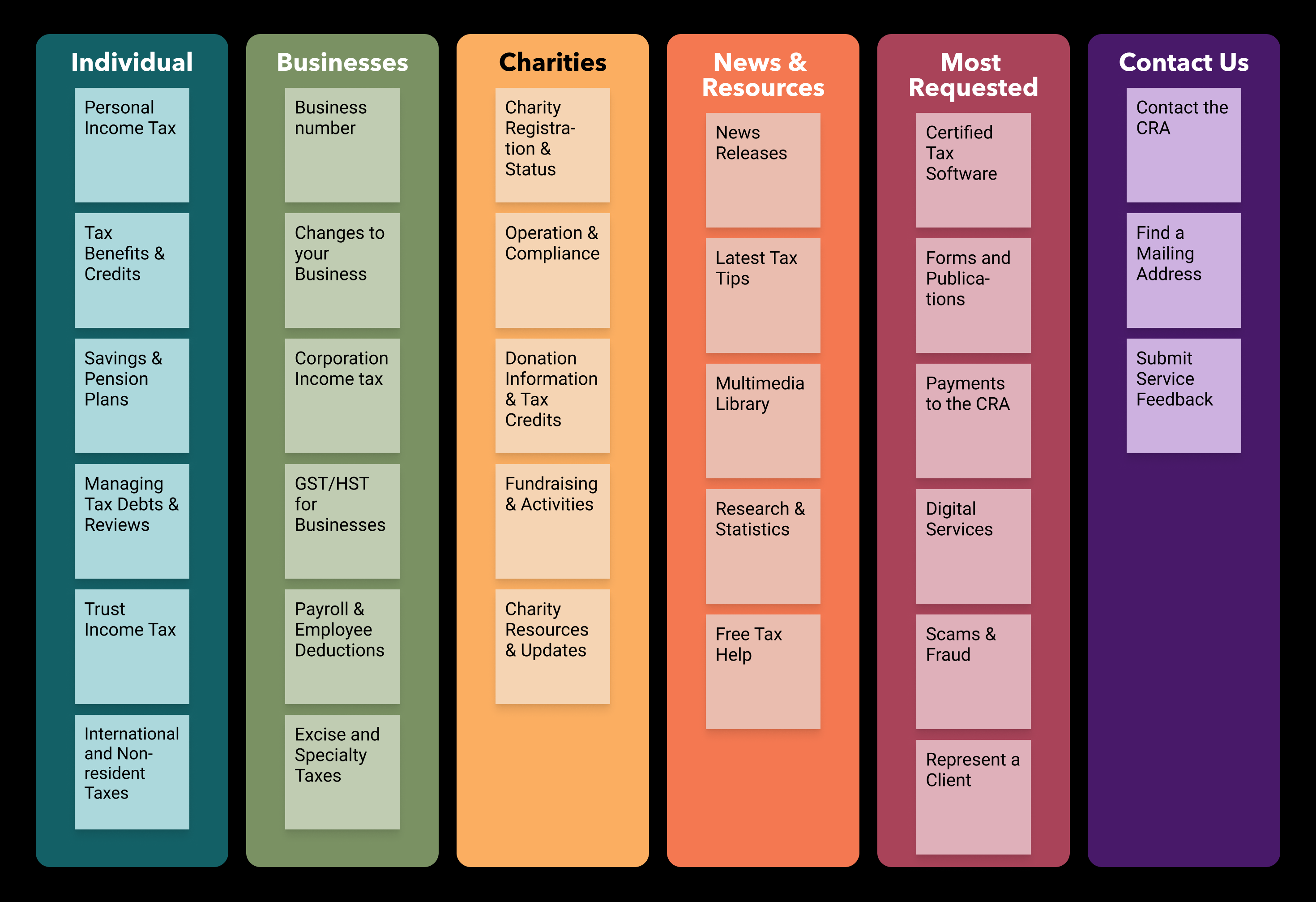
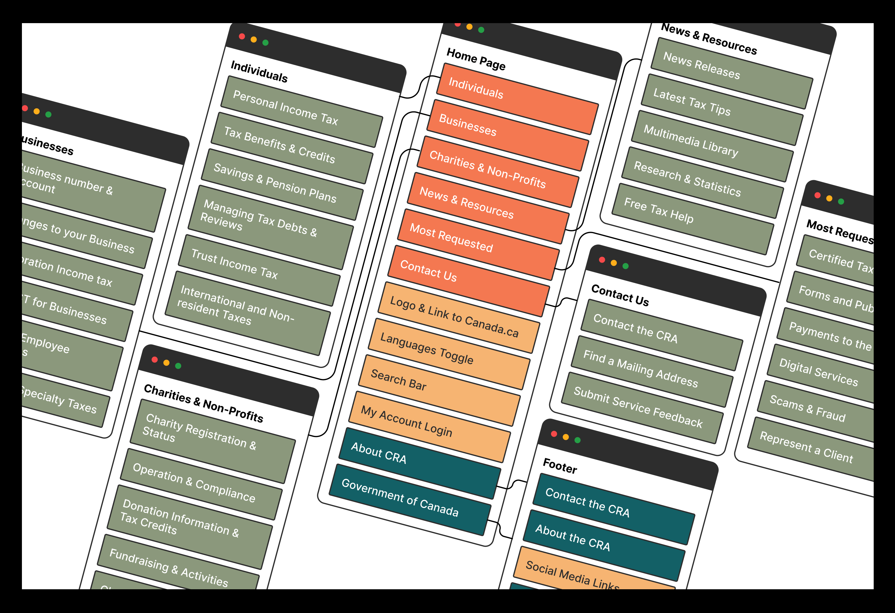
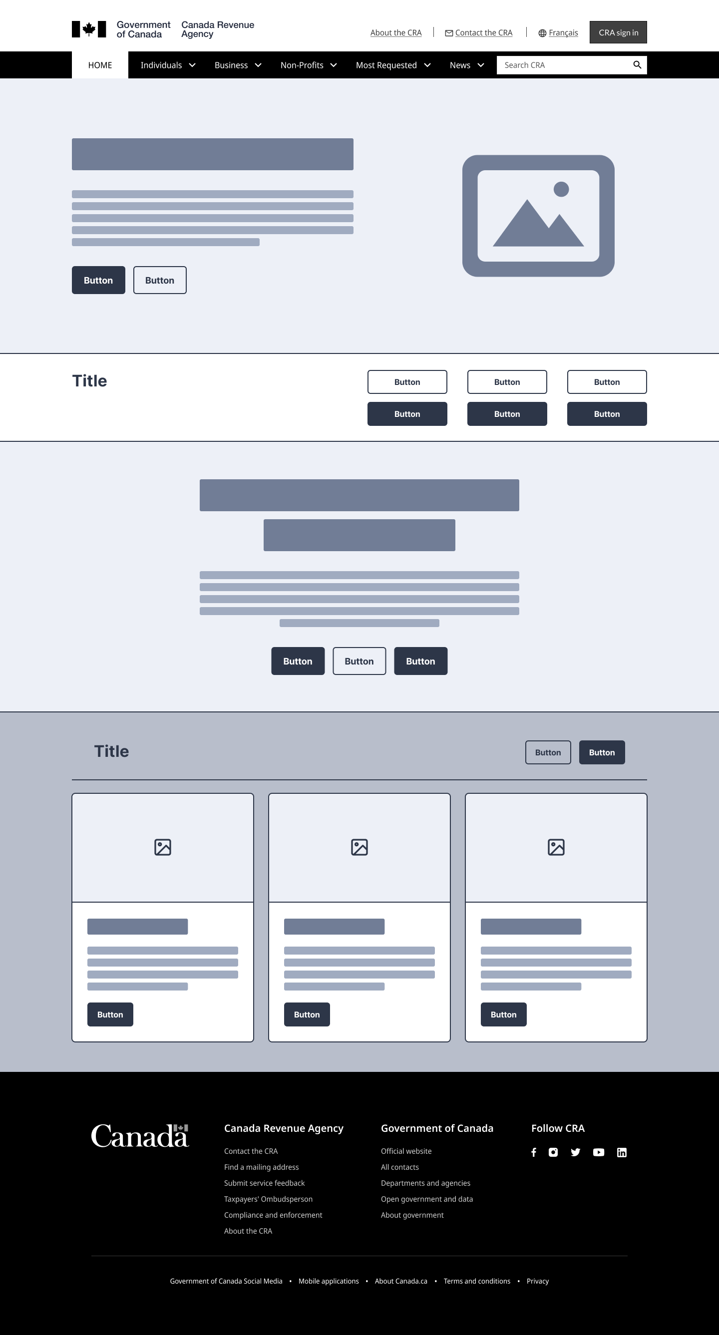
To prioritize a user-centric experience, my design emphasized a straightforward and accessible interface. In my redesign,I preserved the "Sign in to a CRA account" call to action from the original design, but revamped the header and button aesthetics. The delineation between "Individuals", "Businesses & Self-Employed", and "Charities & Nonprofits" ensures clear navigation pathways, responding to users' needs for targeted information. The homepage's redesign represents a balanced fusion of aesthetics and efficiency, encapsulating a modernized vision for the Canada Revenue Agency..
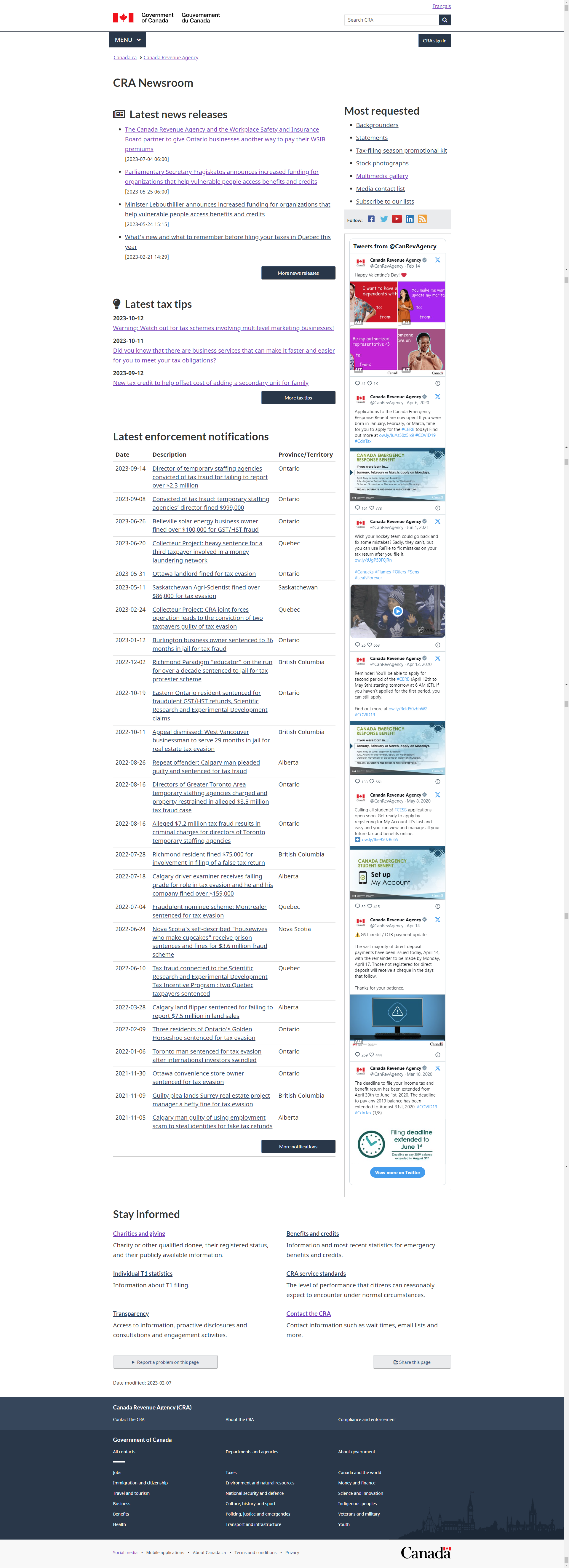
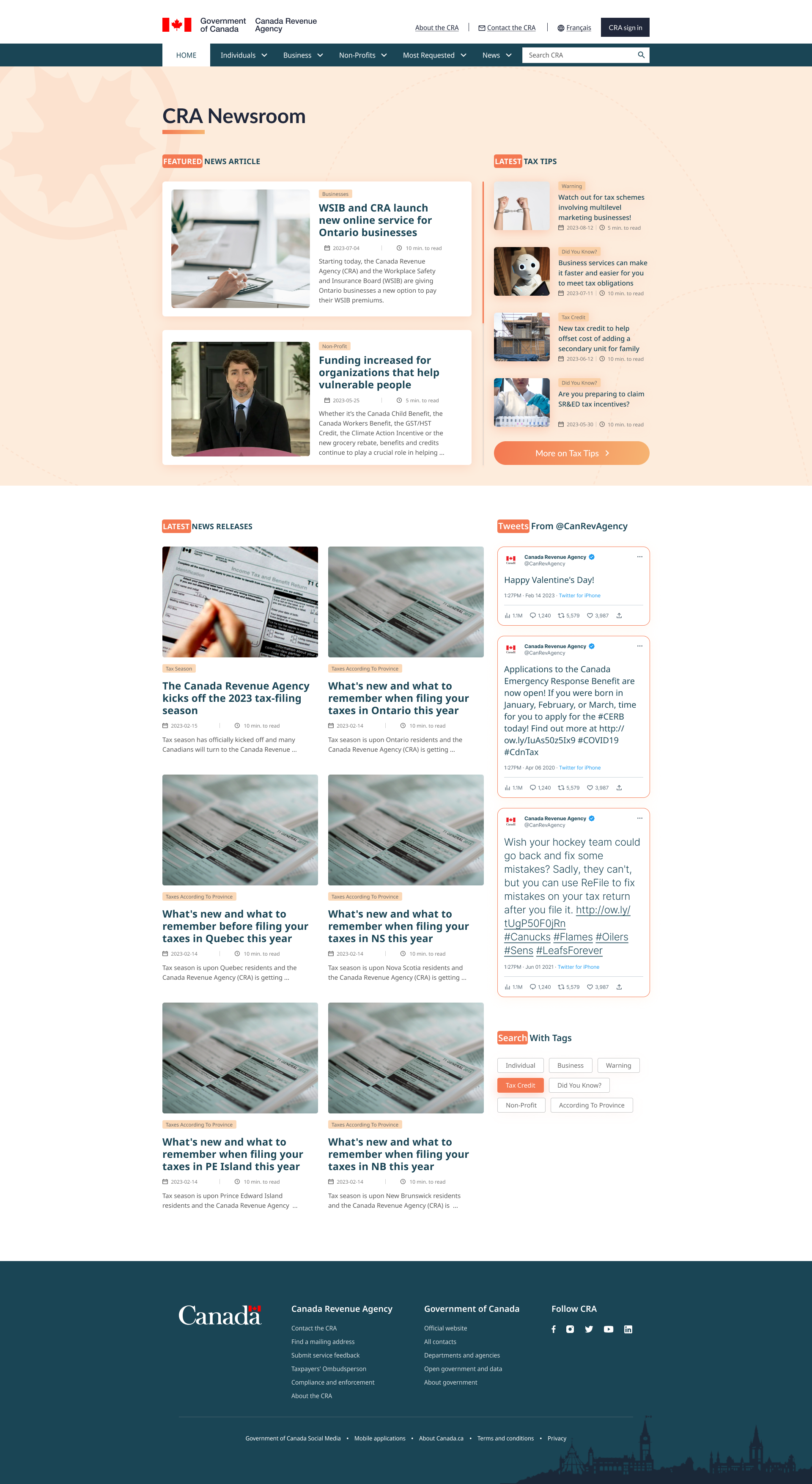
Keeping the user informed and updated

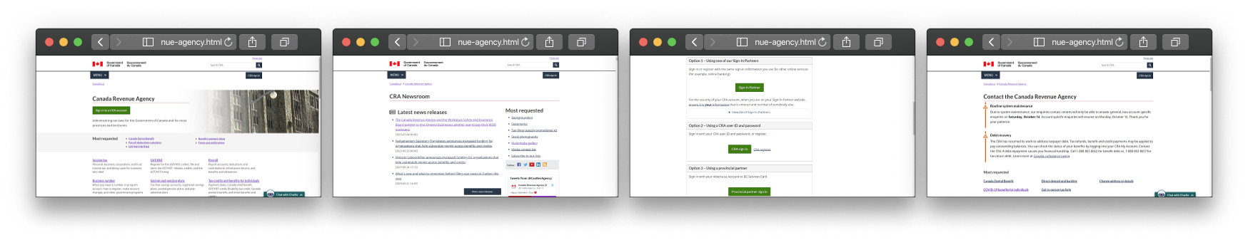
Building on the foundation set by the original CRA Newsroom, my redesigned version sought to empower users with a streamlined and focused experience. Recognizing the diverse audience of the Canada Revenue Agency, I aimed to present information in a clear and organized manner.

Retaining pivotal elements like "Latest News Release", "Latest Tax Tips", and real-time tweets from @CanRevAgency from the prior design, my revamped CRA Newsroom amplifies user-centric navigation and clarity. While these familiar sections offer continuity, new introductions aim to enrich user engagement.

The visually distinct and categorized news articles, systematically aligned, allow users to quickly grasp the most pressing updates from the CRA. Additionally, the "Search With Tags" feature is a novel approach to enhance content discoverability, tailored to user preferences, be they individual or business-centric.
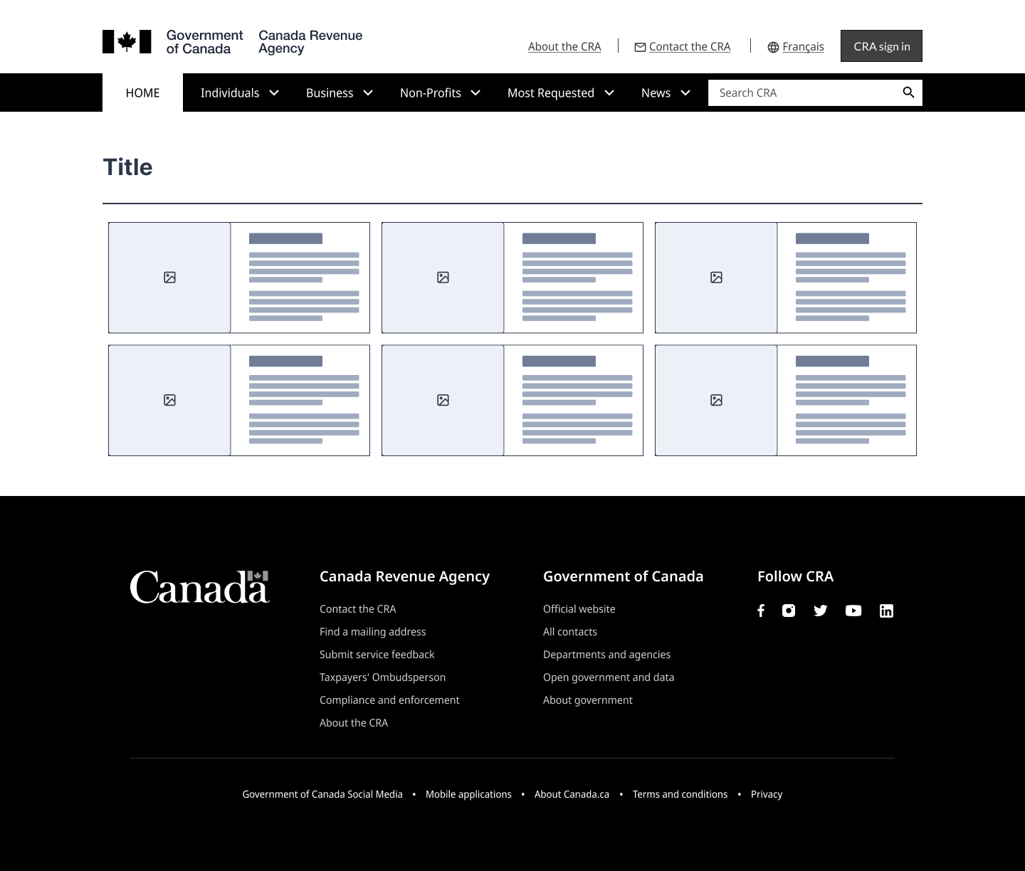
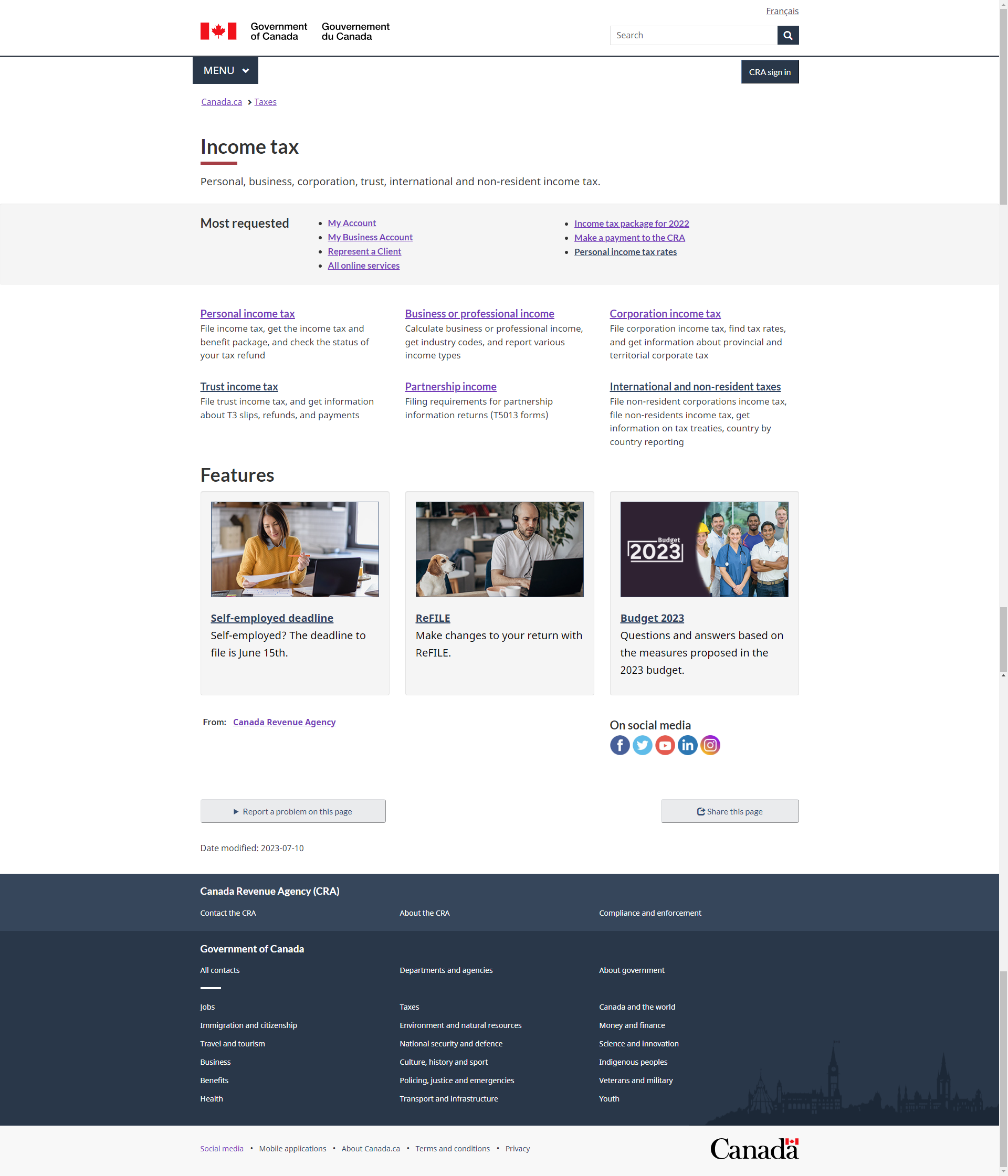
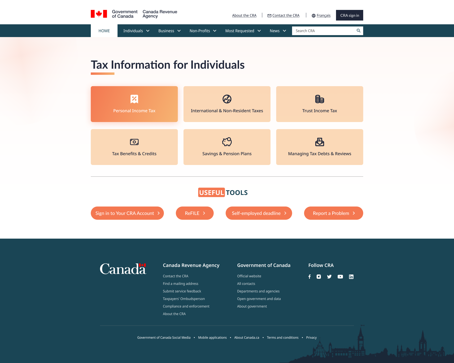
Elevating the Tax Information Experience

Building upon the foundational elements of CRA's previous interface, the new layout features distinct tiles for quick category access and a streamlined "Useful Tools" section. Echoing the broader volunteering opportunities showcased earlier, this design caters to diverse tax scenarios, embodying CRA's dedication to accessible and comprehensive tax solutions for Canadians.
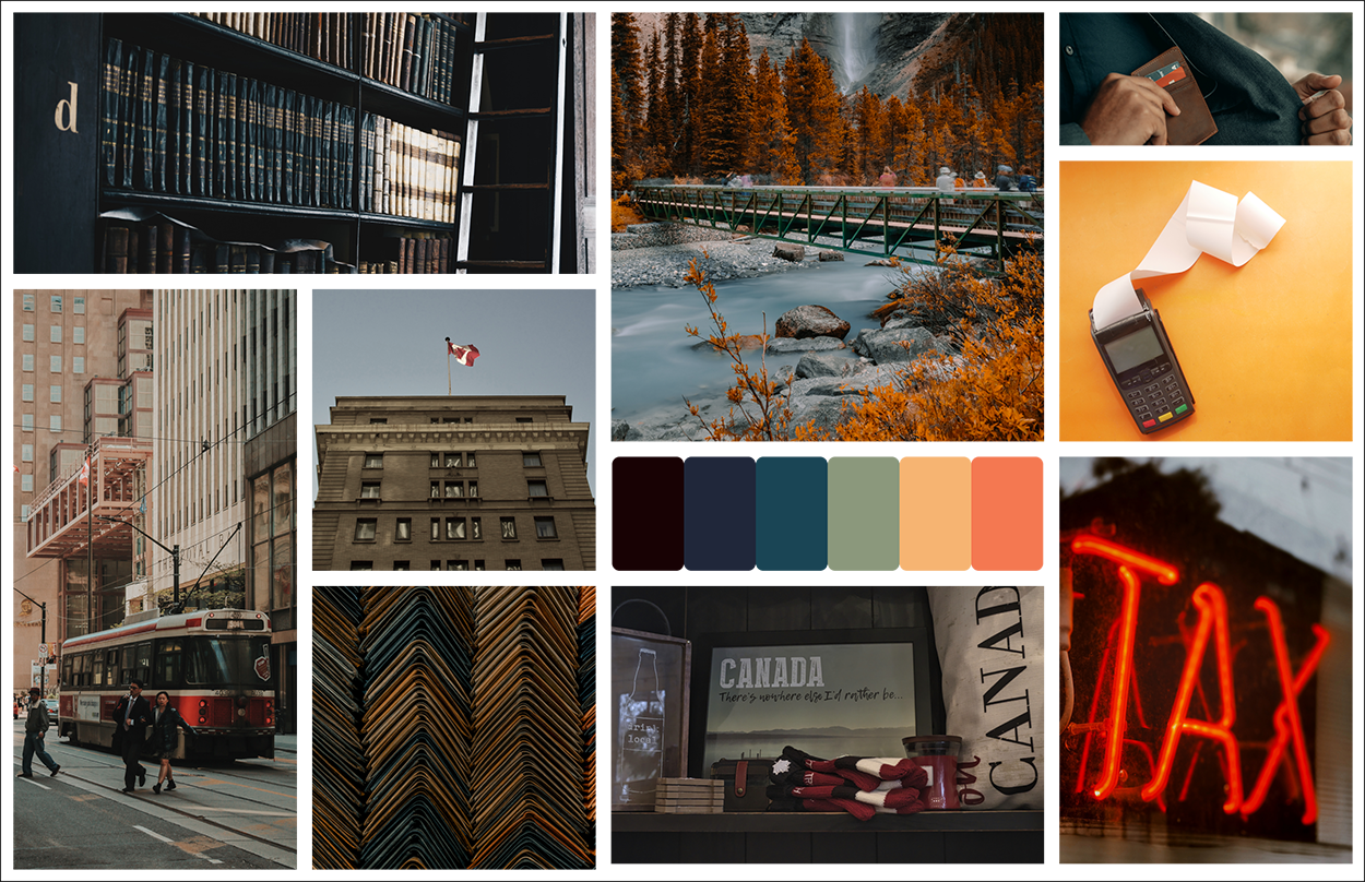
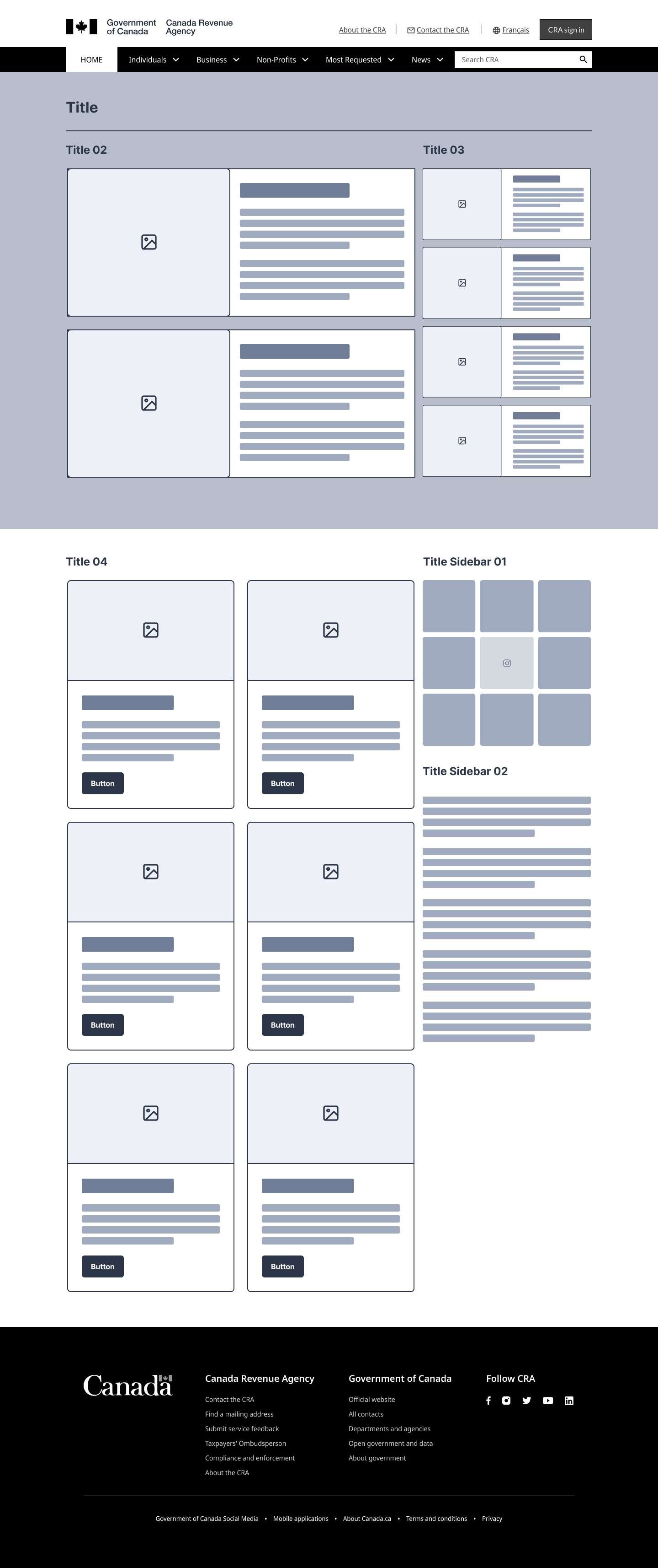
Style Guide

The style guide page serves as a comprehensive blueprint for consistent design, encapsulating the essence of CRA new brand's visual language. It meticulously outlines typography, color palettes, and design elements, ensuring uniformity across all platforms..
Final Thoughts on the Project

The endeavor to reshape the CRA website was a profound journey of challenges and insights. Let's unpack the pivotal moments and decisions that steered this project.
Enhancing Intuitive Navigation
The project highlighted the essentiality of intuitive navigation. It was challenging to streamline the diverse sections of the CRA website. The feedback played a crucial role, shedding light on areas with complexity and paving the path for a more straightforward, user-friendly navigation system.
Effective Information Delivery
Ensuring the content was easily understandable and accessible was paramount. Different approaches to content presentation were experimented with, enhancing the website's overall usability. This trial and error method proved beneficial in achieving a balanced, clear, and informative website layout.
Optimizing for Various Devices
With the burgeoning use of mobile devices, the project underscored the importance of responsive web design. It was vital to ensure the CRA website's seamless functionality across diverse screen sizes and platforms, guaranteeing all users have equal, unhindered access to the essential tax information and services provided.