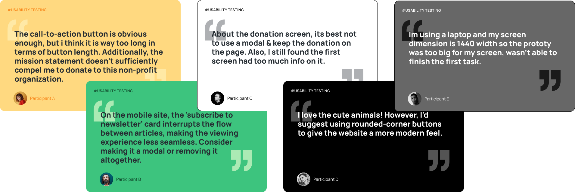
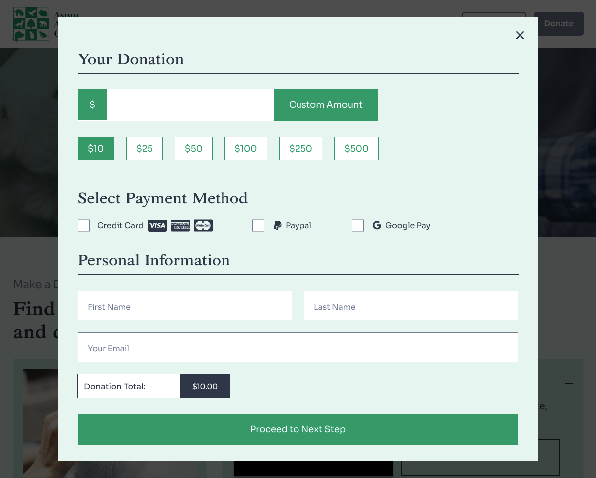
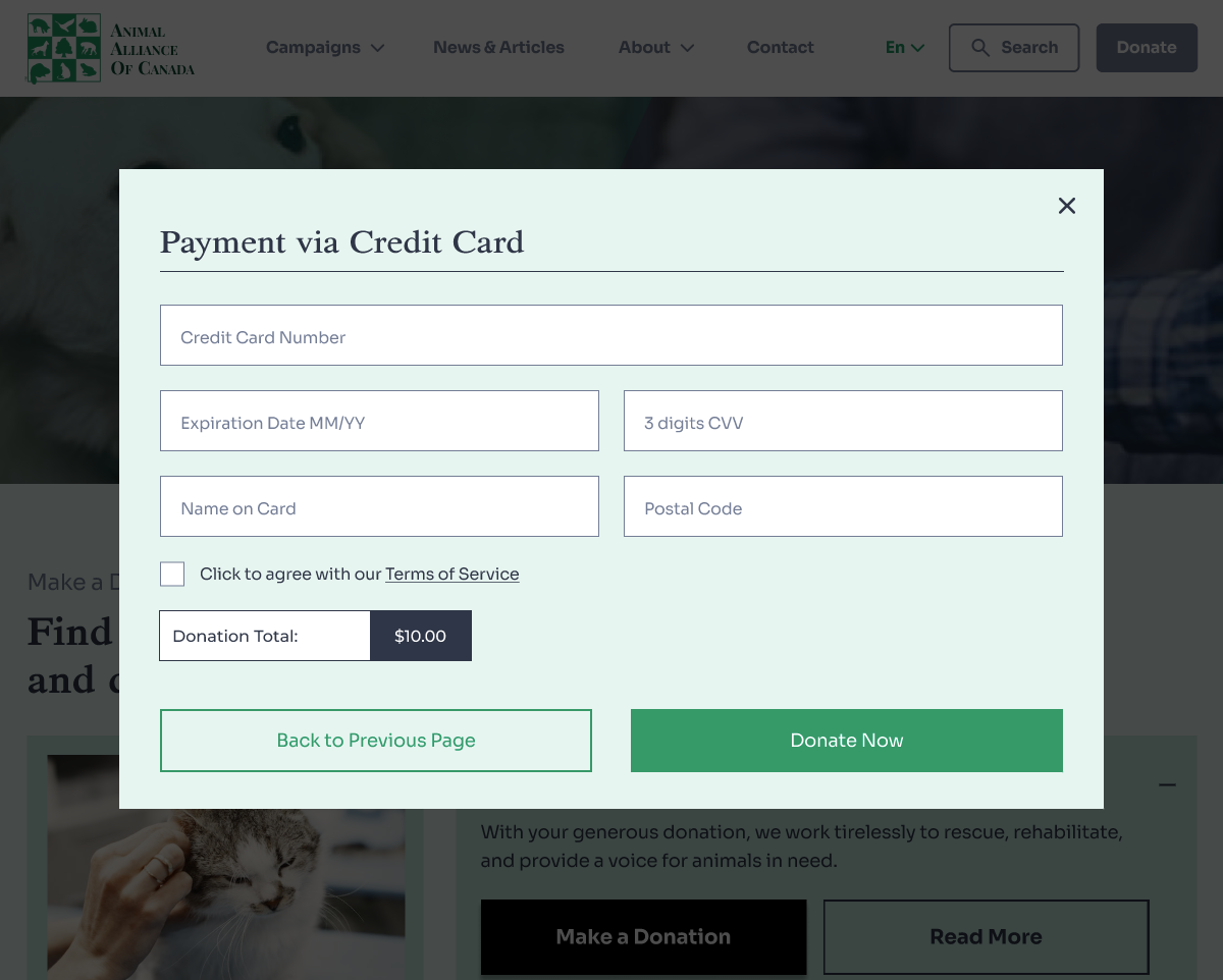
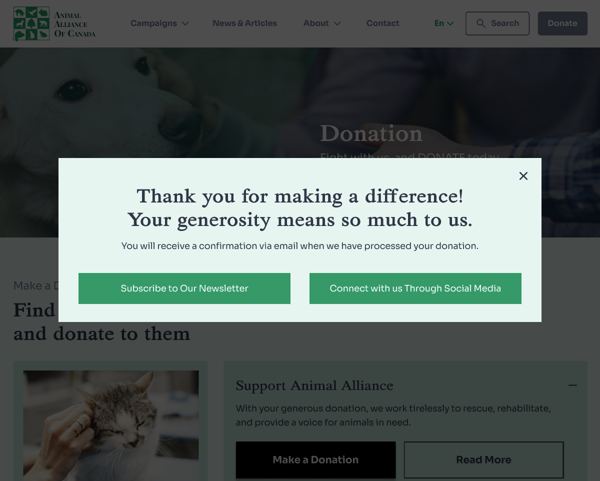
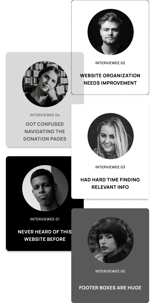
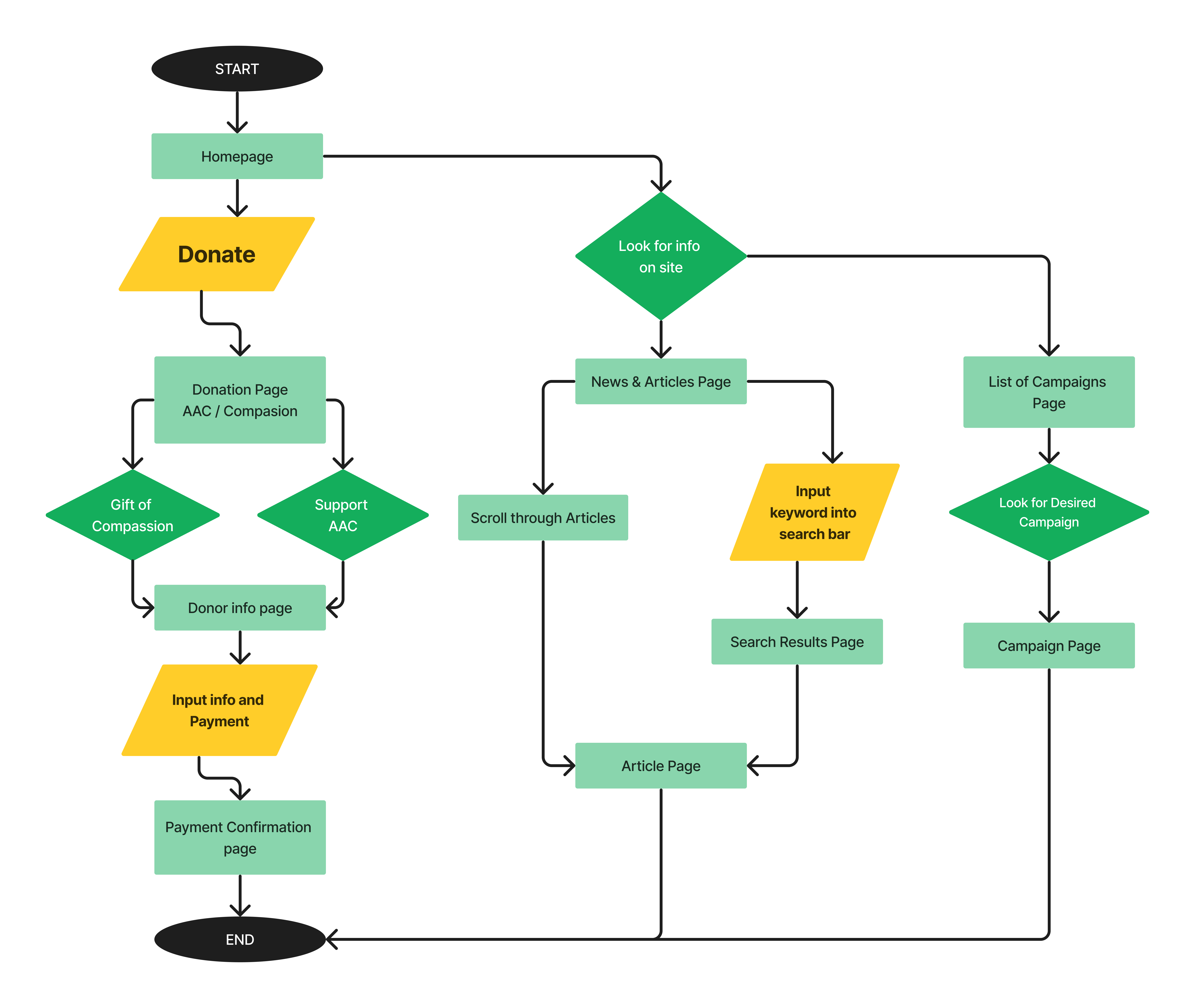
Animal Alliance of Canada Website Redesign
The AAC website previously suffered from unclear call-to-action buttons, lackluster aesthetics, and a missing style guide and grid system. Our group undertook a redesign to address these issues, enhancing the site's visual appeal and usability, ensuring AAC's message resonates more effectively with visitors.

This is a project for UofT SCS UX/UI Design bootcamp.
Team
3 Designers
Duration
3 Weeks
Role
UX Researcher,
Web Designer
Time
Sept 18 2023 ~ Oct 04 2023
Background

The Animal Alliance of Canada (AAC) is a federally incorporated non-profit dedicated to the protection of all animals and fostering a harmonious relationship between humans, animals, and the environment. Since 1990, they have utilized electoral politics and lobbying to champion sound animal and environmental protection laws.
The Problem

While AAC's mission is impactful, their website's design fell short in effectively conveying their message and encouraging engagement. The challenges identified were:
  • Clarifying the website's call-to-action, including the donation process.
  • Enhancing aesthetics through a cohesive style guide and grid system.
  • Optimizing user interface elements such as spacing and content layout.
Click to see wayback machine capture of the website on Sept 18 2023current website

Not interested in my design process?
That's perfectly okay!

Teleport to the Final Product
Research

User Research

To holistically understand users' perception and areas of improvement for the Animal Alliance of Canada's website, we structured our inquiries based on specific research objectives. Here are some examples of our questions:
Navigation, Layout and Aesthetics
“What do you think Animal Alliance's mission and goals are?”

“How would you describe the first impressions of the website's visual aesthetics?”
Intuitiveness of Current User Flow
“What do you think about how the articles are layed out and formatted?”

“How would you rate the clarity and simplicity of the website's call-to-action buttons and prompts?”
Comparative Experiences
“Compare other non-profit orginization website with AAC.”

“What features would you like to see added that you enjoy from other websites?”
  • A significant number of users were unfamiliar with the Animal Alliance of Canada website
  • There was a consensus on the need for improved site organization
  • Difficulty in locating vital details was a common grievance
  • The donation process appeared non-intuitive to some users
Define and Ideate
Heuristic Evaluation

The team collectively scrutinized the current Animal Alliance of Canada website, marking key areas for enhancement. Through collaborative sketching and discussion, we settled on the following design iterations:
  • Implement a Grid System & Style Guide
  • Reposition the Donation Button
  • Add a Search Bar
  • Streamline Spacing and Footer
  • Revamp the Donation Page with an accordion menu
  • Optimize image placements in News & Articles
Competitor Analysis

In our quest to find inspiration and identify superior practices for the AAC website redesign, we embarked on a competitor analysis. Our focus was directed towards both direct and indirect competitors, examining the websites of World Animal Pro, ASPCA, CanadaHelps, and the Humane Society of the United States.

Common design patterns included a prominently placed
donate button and the early display of each organization's mission statement on the homepage. Many also employed preset donation amounts to streamline user donations. Drawing insights from platforms beyond non-profits, we recognized the efficiency of a summary pop-up feature in presenting concise information, a tactic we're considering for AAC's platform to enhance user experience.
User Flow

The userflow is thoughtfully segmented into three primary pillars reflecting AAC's objectives - News & Articles, Campaigns, and Donation. The user flow is meticulously crafted to foster a seamless transition between these sections, ensuring a coherent user journey. Users can conveniently access the core content via the Homepage, streamlining their engagement and enhancing their overall experience with AAC.
horizontal userflow
Wireframing
Usability Testing

Upon finalizing our wireframes, we moved to the pivotal stage of usability testing. To gather real-world feedback, we employed the online user testing platform, Maze. This allowed us to tap into diverse user perspectives and get hands-on experience feedback without geographical constraints.
usability testing quotes
We took these comments to heart and implemented necessary changes to optimize user experience. However, we also received some feedback about our design choices, such as the suggestion to use rounded buttons instead of sharp-edged ones. We decided to retain our original design in this aspect, recognizing the importance of personal aesthetic preferences and staying true to our brand's identity. With the feedback assimilated and changes made, we proceeded to the next stages of our design process.
Final Product
Guiding Users Towards Empathy and Action

To rapidly capture our audience's attention and steer them towards the essence of AAC's mission, we prominently showcased the 'Donate' button as the pivotal call to action, accentuated by its vibrant hue. This strategic placement and design choice not only accentuate the donation pathway but also foster a seamless blend between the organization's objectives and the user's inclination to support, thereby facilitating meaningful interactions and contributions.
Streamlined Insights for a Compassionate Community

Recognizing the importance of keeping the community informed and engaged, we revamped the 'News & Articles' section of the AAC site. With user-centricity at its core, the page now boasts an improved layout governed by a grid system, ensuring that articles are presented in a structured and readable manner.

A significant enhancement is the introduction of the 'Featured Article' category. This prioritizes pivotal stories and discussions, ensuring that visitors are immediately presented with crucial insights and updates about animal advocacy and welfare.

In essence, our redesign seeks not only to provide information but also to foster an environment where readers are inspired to delve deeper, learn, and actively contribute to the cause.
Crafting a Purposeful Donation Journey

Understanding the importance of a seamless and meaningful donation experience, we restructured the 'Donate' section of the AAC site. With clarity in mind, we created a dedicated space for cause selection, allowing users to directly support initiatives that resonate deeply with them.

To further enhance the donation process, we introduced the "Gift of Compassion" as a distinct option. By delineating this from the general support donations, users are now presented with clear choices, reducing confusion and decision paralysis often experienced when faced with similar donation avenues.
Optimized Donation Experience for Swift Contributions

Recognizing the importance of a user-friendly donation process, we undertook a redesign of the AAC donation form to ensure a hassle-free experience for supporters. The revamped form is streamlined, focusing on gathering minimal personal information before leading donors to the payment details.

To further simplify the process, we introduced suggested donation amounts, allowing donors to quickly choose a contribution level that aligns with their intent. These preset amounts aim to make the donation journey quicker and more intuitive.
Style Guide

Within this guide, you'll find a curated collection that encapsulates our design philosophy. Meticulously crafted, it serves as a compass for visual consistency for the redesign of AAC, bringing together color palettes, typography, and design elements.
Interactive Mobile Prototype
Dive into my meticulously crafted interactive responsive prototypes that breathe life into design concepts. Experience firsthand the user-centric interfaces, intuitive navigation, and seamless transitions.
Next Steps

As I look ahead, my intent is to delve deeper into the broader realm of the Animal Alliance of Canada (AAC). The focus will shift to strategizing methods to galvanize more individuals towards AAC's advocacy. This encompasses probing both offline and online strategies to amplify the awareness of AAC's mission and, in the process, channel increased traffic to the AAC website. Potential avenues to be explored could include innovative initiatives like partnering with animal-friendly brands for exclusive collaborations or organizing community-driven events to shed light on AAC's ongoing campaigns and projects.

My Learnings: A Voyage of Discovery
This AAC project has been nothing short of a revelation for me. In the span of the project's timeline, our team achieved an astonishing volume of work, transcending our own expectations. This journey was replete with insights about not just the process and the realm of animal advocacy but also about my personal growth and capacities.

Here are two pivotal takeaways I believe will sculpt my professional trajectory and design ethos:
Synergy Matters
While my portfolio is teeming with collaborations from multidisciplinary spheres, this was my inaugural stint collaborating exclusively with UX designers in the context of animal advocacy. The dynamism of this setup ushered in unique challenges. I honed my receptive skills to feedback and critiques and learned to harmonize with the working styles of fellow designers. The AAC project has undoubtedly refined my collaborative skills, priming me for diverse ventures ahead.
Research: The Bedrock of Design
In contrast to some of my earlier projects, the AAC endeavor demanded a pronounced emphasis on research. I embraced this as a golden chance to bolster my research acumen and immerse myself profoundly into understanding our users and their intricacies. Encountering novel research methodologies and scenarios was enlightening, and I am confident these insights will enrich my design endeavors in the subsequent phases of my career.